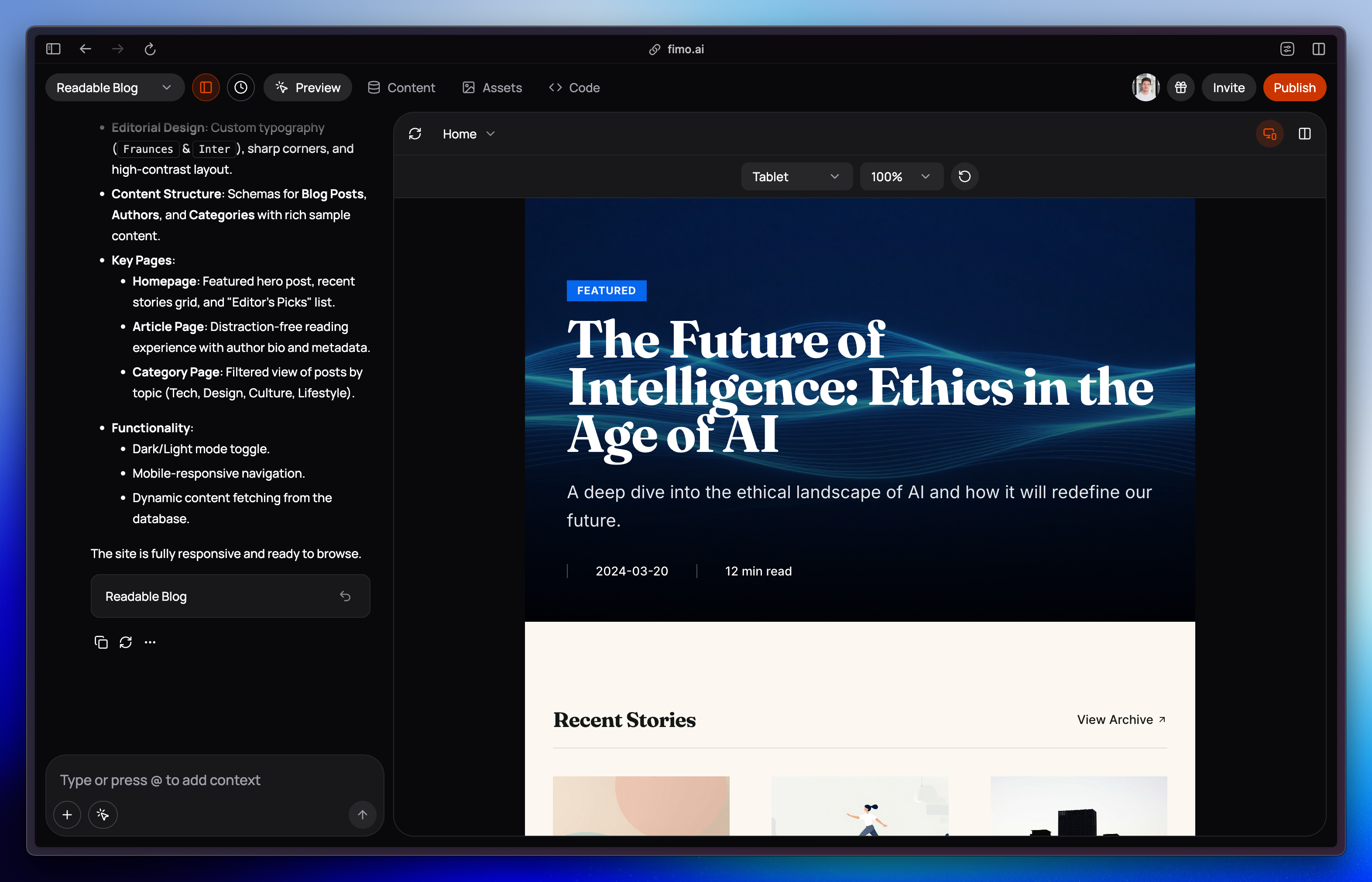
Responsive mode works alongside other tools.
You can edit content, add comments, or refresh the preview window while viewing different devices.
You can edit content, add comments, or refresh the preview window while viewing different devices.
Why use Responsive mode?
Test layouts
Check how your design adapts across desktop, tablet, and mobile.
Simulate devices
Toggle between portrait and landscape orientation.
Adjust zoom
Change the zoom level of the preview window for easier review.
Catch issues early
Spot and fix layout or spacing problems before publishing.